Design / The identity
The shape
of Athledex.
Movement, energy and connection are at the heart of Athledex. The logo brings them together in a single symbol, built from the letters of its name.
Inside the identity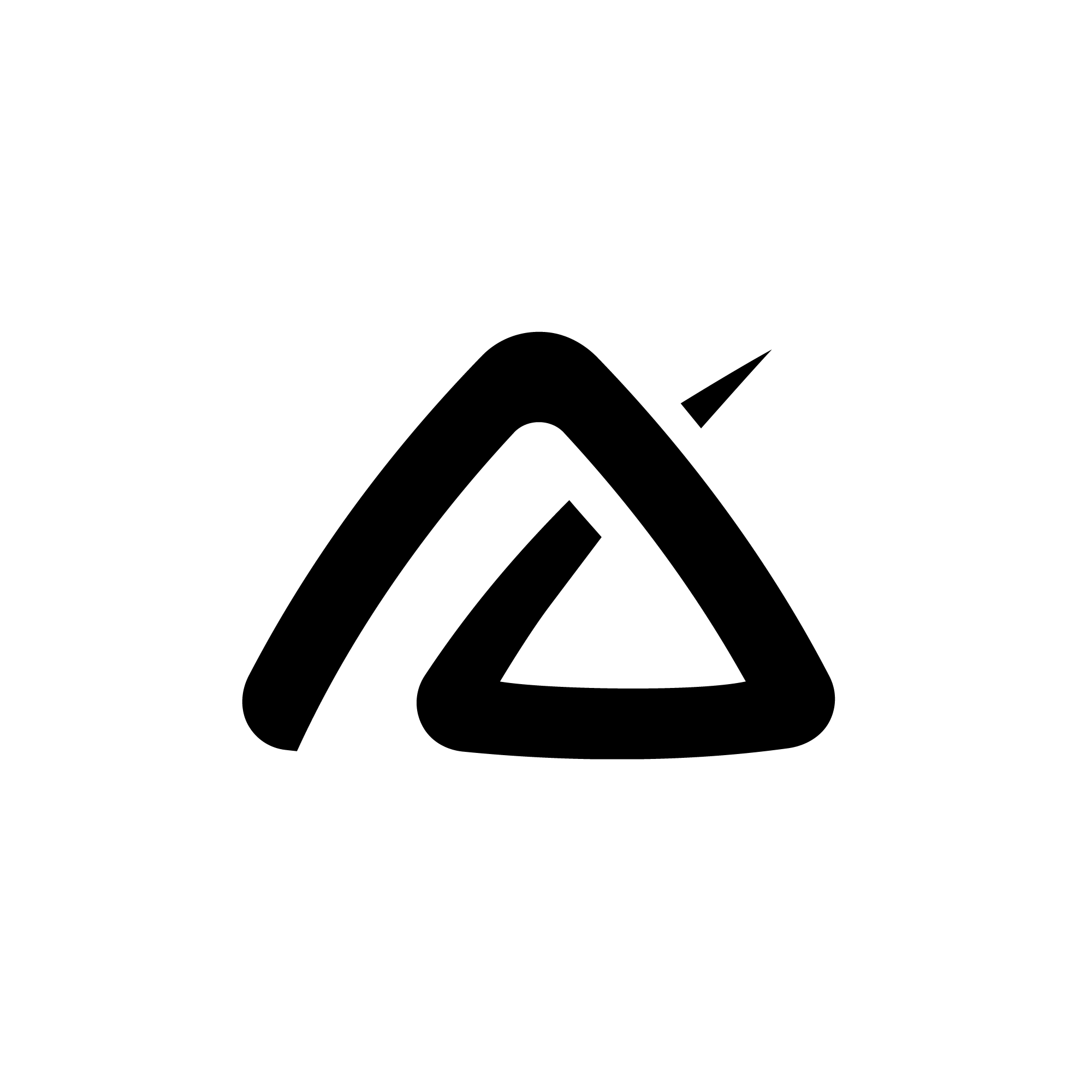
01 / The name
Athlete + Index
Athledex brings these two words together: the people who practise sport, and the idea of making their world easier to discover.
- Athlete
- The person comes first. Whether you’re finding your feet or competing at your highest level, there’s an athlete in you worth getting to know.
- Index
- An index helps you find your way into something bigger. Here, it stands for discovering athletes, sports and stories you might otherwise never come across.
02 / Construction
Five letters. One symbol.
Look closely and you’ll find A, T, L, D and X woven into the same shape. Bringing these letters together expresses unity and inclusion: a place for every sport and every athlete, whatever their discipline or level.
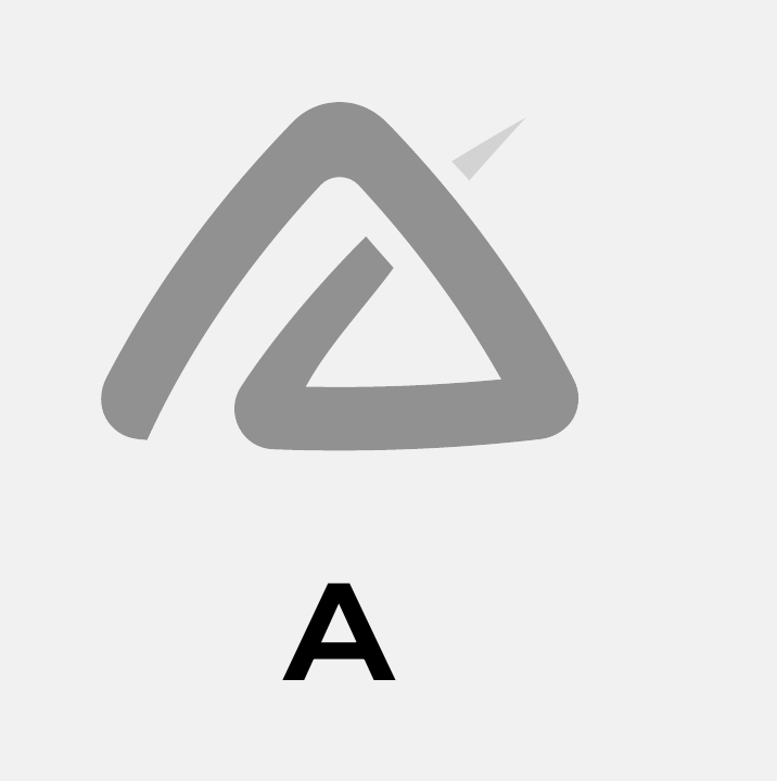
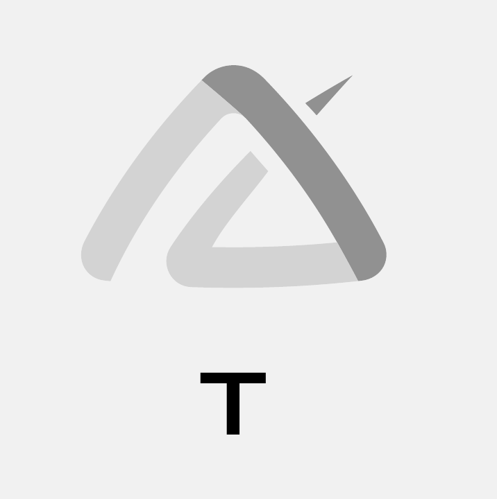
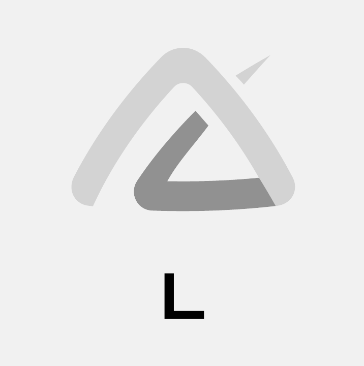
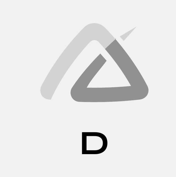
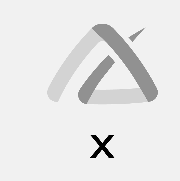
Letter studies from the original Athledex identity presentation.
03 / Movement
An upward direction.
The triangular flow and sharp accents give the symbol its upward momentum. They carry the energy, resilience and ambition of sport.
The design stays simple and recognisable, with clean lines that work across digital and physical settings. The same identity carries through, whether the symbol appears on its own or alongside the full name.